"You put together fantastic newsletters EVERY WEEK!! How do you do it!?" - Teresa
I received this question in my inbox this week and realized it would make a great blog topic! Obligatory disclaimer: This is my method, this is what works for me. Maybe you can find some helpful info here and maybe you'll be shaking your head at me if you're a seasoned email marketer!
Decide what your goals are.
I'm looking to build a stronger relationship with my customers and potential customers. I enjoy having this blog for my long-winded thoughts, but it's more of a time and energy investment to update it and I realize that not every customer wants to read blog posts. I see my newsletter as a quick way for my customers to better get to know me, my designs, and my brand. Obviously I'm looking to make money from my designs, but I'm personally against sales-y emails that only push, push, push products or services. I want to offer content that's interesting whether or not the readers wind up buying one of my patterns.
I also am hoping to use my newsletter to convert some of my Instagram followers into customers and dedicated fans. I'm always mindful of the advice that any social platform can be taken down, so if you're counting on Instagram (or Facebook, or Twitter) as being your link to your customer base, you'll be in trouble if that platform is suddenly taken offline for good. An email list connects you directly to your customer AND you don't have to worry about losing your following.
Knowing your goals will help determine the type of content you share, how frequently you send your newsletter, the tone of voice you use, how you promote your newsletter, and so on.
Choose an email service and format.
I use MailChimp because it's free until you have 2,000 subscribers, so you can get your feet wet and figure out if you'll really commit to a newsletter before committing to a paid service. You can create a generic template for your newsletter and edit the content in it as you compose emails (called campaigns in the MailChimp universe), which helps save you time and keeps a consistent look across your emails. I chose to use fonts similar to what's on here for consistency's sake. I'm in the middle of a logo design and branding process with Knit Fitch, so once that's complete I'll likely change my website and my newsletter template to fall in line with that.
I send weekly newsletters since I believe it's important to keep a regular line of communication open with my customers. I would have longer newsletters if I sent them less regularly, and I prefer to keep things short and sweet. I ran a quick survey a few weeks ago asking my newsletter subscribers what their preference was, and overwhelmingly they also preferred weekly newsletters. Always nice to have some reassurance that your audience is in sync with you!
Content, content, content.
This is probably the hardest part and I'm guessing what Teresa was most curious about! I definitely have weeks where I struggle with this, especially if I'm working on the same project for weeks on end. In my newsletter survey, I asked people what they liked to read about and learned they were most interested in knitting tips, behind the scenes, and photos. Of course, your customer base might be different--ask them what they like!
My default template includes several regular sections, and I will admit I was heavily inspired by Andrea Rangel's awesome weekly newsletter. (Pro tip: Subscribe to other people's newsletters in your industry to see what they do!)
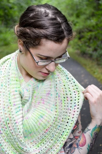
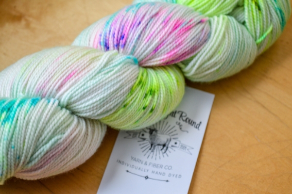
- My newsletter opens with a photo, anything that I've photographed recently that I think is visually interesting or relevant to the content of the first section.
- My first section is general chit-chat. I might talk about something in my personal life I've been doing, a project I'm working on, a struggle I'm having, or hint at a new project.
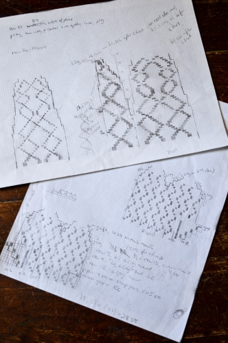
- The middle section is the longer meat-and-potatoes portion of the newsletter. In the past I've: showcased my progress on a design WIP, talked about a new release, provided a knitting tip, spotlighted designers, patterns or links I'm currently into, or announced a KAL or event.
- After that I always include Instagram of the Week, which is the photo with the most love from the last week on my Instagram account.
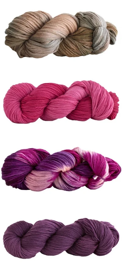
- The final section is a wildcard. Regular themes include Q&A and a color story mini mood board, but I've also shown off finished FOs of my designs from customers.
- It finishes with a link to the Weekly Newsletter thread in my Ravelry group and my signature.
